When I started trying to promote my own artwork online I kept coming across other people's art that amazed or compelled me in one way or another. This blog has been a way for me to practice thinking and writing about art, as well as learning more about my peers and all the incredible art that is being made out there.

Search for an Artist on this blog (or cut and paste from the list at the bottom of this page)

Showing posts with label pop-surrealism. Show all posts

Thursday, January 30, 2014

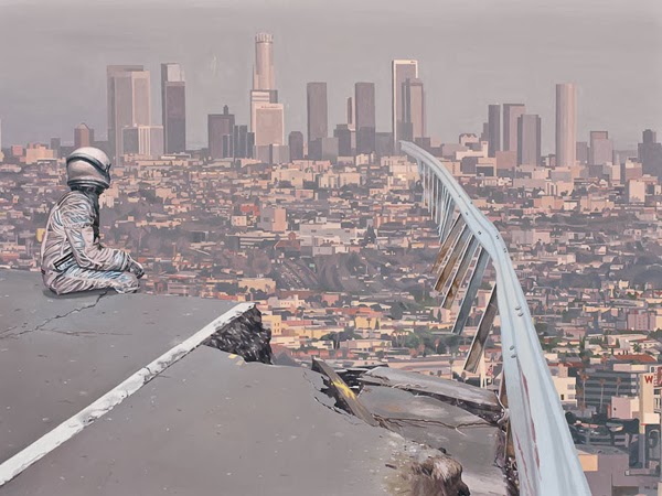
Scott Listfield

"Lost Highway"

"Runway"

"Alien Crossing"

"New Moon"

"Parking Ticket"

One of the things I love about Scott Listfield is that in every email announcement he includes the phrase "that guy who paints astronauts" in the subject line. The message is clear. Don't worry about the name. All you have to do is remember what he does. And once you see these, you will remember. I don't mind at all if an artist's is essentially a shtick, as long as they're totally committed to it and can pull it off with style. Scott Listfield does so by working in a flat, almost paint by numbers kind of realism that serves his pop-culture purposes beautifully. There is no doubt that humor is at the forefront of his agenda but there's more to it than that. He's equally concerned with consumer culture, references to pop-art and how both of these these play into and against the utopian and dystopian dreams of science-fiction. The dark side of his humor suggests that the more pessimistic tales of imaginative fictions better reflect the reality we live in than escapist fantasies like Star Wars that both he and the rest of us clearly love. His paintings declare that the future is now, and frankly it's a bit depressing. But Mr. Listfield examines this fact with wry wit, and I for one am grateful for it.

I posted his work once before back in September 2010 and still stand by what I wrote then as well.

You can see more at his website (astronautdinosaur.com)
or see his newest on his Tumblr blog.


Monday, December 16, 2013

Stephen Hall

American Still Life"  acrylic on canvas  40" x 60"  2013

"Calavera"  acrylic on canvas  24" x 32"  2013 

"Don't Hold Your Breath"  acrylic on canvas  60" x 30"  2013

"Leap Frog"  acrylic on canvas  60" x 36"  2013

"Sinner"  acrylic on canvas  32" x 44"  2013
Here's a different take on the pop-surrealism front. Flat graphic designs depicting a bewildering array of ordinary and bizarre objects from eggbeaters to brass knuckles which are superimposed upon backgrounds, other objects, clothes or even human flesh. If it is not entirely clear what the references mean or how they relate, well, don't worry about it too much. Let the odd juxtapositions exist for their own sake and measure your response subjectively. There is humor here as well as a dark pessimism. Nature flits about the devices of human violence but their relationship is not always clear. This is the heart of surrealism. Dreams create symbols by reordering context. Metaphor is not analogy. This does not represent that. Metaphor means one thing can be interpreted as almost anything else. The human mind is designed to makes novel connections and unlikely associations and in so doing discover new meanings. Art in this sense is always a participatory affair. Though the artist works in private the art itself is not complete until new eyes receive it and reinterpret it outside that intentions of its creator. So what do you think is going on? The success of such work depends on it's ability to arrest our attention and successfully invite us to play with its ideas.
You can see more at the artist's website: www.stephenhallart.com

Tuesday, November 26, 2013

Kent Knowles

"Urchin"

"Oddity"  acrylic on canvas  40" x 30"  2013

"Song"  acrylic on canvas  30" x 40"  2013

"Niagara"  acrylic on canvas  40" x 30"  2013

title unknown
Kent Knowles, in addition to being an artist, is also apparently an illustrator, an animator, a screen writer, and a parent. For those of you who don't have kids, that last bit of information makes this list all the more impressive. Despite the limitations of dividing finite time in to a plethora of pursuits, he still manages to be a prolific painter (please pardon the alliteration - it just happened that way, I swear). More importantly though, he's a very talented painter as well. He combines an obvious love of traditional techniques with a contemporary narrative sensibility. That sensibility, often lumped under the loose term of pop-surrealism, often flies in the face of twentieth century post modern concerns, embracing narrative forms, illustrational techniques and dark humor. The illustrative styles that most members of this creative tribe employ are detail oriented and tight. But Mr. Knowles, an illustrator himself, and author of the children's picture book Lucius and the Storm, uses loose confident expressionistic techniques that serves to heightens the effect of his evocative imagery. His characters, frequently young women, seem lost in a perplexing and sometimes frightening, but always fascinating, natural world. Looking back through his early work I began to wonder if his drawing style and subject matter wasn't some kind of odd amalgam of Odd Nerdum's stark surrealism and the large-limbed figures of Picasso's neo-classical phase. Maybe you could throw in a little early Lucian Freud for good measure. But whatever it's sources or inspirations the results are uniquely his own.

To see more visit the artist's website: www.kentknowles.com
You can see original work at Linda Matney Gallery in Williamsbirg, VA
and at Kai Lin Art in Atalanta, GA
Thursday, August 1, 2013

Nick Sheehy aka Showchicken

"The Sitting"

"The Woodcutter"

"The Damage"

"Masque of the Red Death"

cover art for the first issue of Tiny Pencil magazine

I posted Nick Sheehy's work almost two years ago (Sept. 2011) and he's been busy since then. While I enjoy pretty much everything he does just recently this series featuring a peculiar double skull character has resulted in some of my favorite pieces to date. Nick is an Australian born artist who studied sculpture in Tasmania, only to drop out of art altogether for a spell. Now living in southeast England his artistic interests were reignited by the low-brow and graffiti art movements. I rather like what I wrote last time so for once I'm going to simply paraphrase what I said before:

His unique surrealist narrative vision begs the viewer's mind for a rich tapestry of story and myth. It's as if the mythology, the gods, heroes and queer characters that inhabit his work always existed but we forgot about them. That is until Mr. Sheehy's came along with these illustrations to remind us of this elaborate and haunting heritage.

His work has a mythic dimension and an almost epic scope, even while the individual pieces themselves are small and delicately drawn. It's well worthwhile to take some time and look back through the evolution of his imagery. You'll see familiar motifs and characters recur not because he's stuck on old ideas but because that's how stories work. Each time something recurs it's as if a familiar thread is being brought back into an ever growing and elaborate tapestry of myth making.

Check it out on his Flickr page or on his website: www.showchicken.com


Monday, March 4, 2013

Hsiao-Ron Cheng

"Weeping" digital painting 2012

"February Afternoon" digital painting 2012

"The Child and the Fox"  digital painting 2013

"November"

"Stuck" drawing

Hsiao-Ron Cheng is a Taiwanese artist exploring the world of pop-surrealism. She works primarily digitally, so for once I don't have to fret too much about not being able to see the work in person. This is it, if not at the highest resolution possible. Her themes are focused squarely on childhood and nature, how the two naturally intersect and how they are all too often separated. I think there is longing in all children for a deep connection to the natural world. For those that grow up in dense urban environments, that longing can turn into a bittersweet heartbreak of fantasy and despair. The lost presence of nature "out there" is internalized and comes to represent the sense of isolation and and separateness that most children experience as they near maturity. It is a poignant emotion both universal and intensely personal. Each experience of this sort is likely to make a person ask, "Am I the only one?" The answer of course is no, but sometimes it is only art that really can communicate this truth with any meaning to those who feel on the verge of despair. I suspect that her art has touched more than a few young people out there.
You can see more at her website: hsiaoroncheng.com or on her Flickr page.
thanks to booooooom.com for posting her work before me.

Thursday, September 13, 2012

Robert Sato - new show

"Siege" from the new show "Haunts"

untitled from the new show "Haunts"

"Island"  watercolor on arches paper  16" x 17"  2011

"Asleep at the Wheel"  watercolor on molachi paper  9" x 9"  2011

"Ghost Ride"  watercolor on molachi paper  35" x 84"  2011

I posted some of Robert Sato's watercolors just one year ago (Sept. 1, 2011), and had almost nothing intelligent to say about the work except that I liked it. Well, I still do. And if I happened to be in L.A., which I'm largely grateful not to be, but if I was, I would most definitely go see his new show "Haunts" (along with artist John Pham) which is currently up at Giant Robot through Sept 26). Robert's work often depicts conglomerations of objects, flying apart or coming together to form new objects. Individual items are often morphing into other things or are in fact two things at once, or perhaps unrecognizable pieces of a something else altogether. There is no doubt that surrealism is the most useful label here, but there is sometimes a more conscious meaning. The chaos that seems ever present here reflects the chaos of our post-industrial world which has turned out to be just the opposite of industrial age dreams. Hopes for technological solutions to all the world's woes and an orderly arrangement by human reason have given rise instead to confusion, unpredictability and possibly, in the end, collapse and disintegration. Robert Sato's vision is not a grim commentary on all this, but rather one of a lively participation in the ensuing anarchy.
Please check out his website: www.robsato.com

Thursday, August 2, 2012

Jonas Löfgren

"getaway"  graphite on paper  2012
"The House"  graphite and watercolor  2009

"Nowhere"  graphite on paper  2011

"The Cellar"  graphite on paper  2010

"Diamond #8"  graphite, ink and watercolor  2011

Jonas Löfgren is a Swedish artist whose work fits into that wealthy vein of contemporary work called pop-surrealism or sometimes low brow art (there's some confusion about the terms). European takes on the genre tend to be less literal than their American counterparts, more cryptic, less obviously eye-winkingly ironic. Many elements here are common tropes: the generally realist rendering of cartoon like figurations of pre-adolescent characters at odds with a dark confusing world. I enjoy this kind of work in general as anyone whose been following along with me for a while would probably know. I like the lack of pretension, such a welcome relief from all the inaccessible over conceptualized material that haunts the museums and galleries of the high end contemporary art world. But despite the lack of pretension, there is a tremendous amount of both skill and emotional honesty on display. The work is both personal and reflective of a global cultural point of view (which I'm still struggling to pin down and define... no doubt when I do it will have long since moved on). Mr. Löfgren brings to all of this his own unique bag of images and props as well as a haunting drawing style. You can see plenty more including some animation work on his website: www.jonaslofgren.com


Thursday, July 5, 2012

Marco Wagner


Like the artist in my previous post (Esao Andrews) and many others, Marco Wagner is another artist/illustrator blurring the lines between the two endeavors.The term pop-surrealist is sometimes used to describe the genre, although the more familiar I become with it the less suitable the name seems. But that's the nature of labels. Marco Wagner's work reflects the nuanced differences between artists of this sort in Europe and those in the U.S.. Much of the work in the U.S. leans towards the cartoonish, fantasy, or kitsch, often but not always with a healthy dollop of sarcasm. Marco Wagner's work on the other hand leans toward a generally more serious tone with a greater emphasis on design and technique. These are often dark images and somber themes tempered slightly by a lightness of approach.
There's plenty of both his personal work and his illustration on view at his website: www.marcowagner.net

Monday, July 2, 2012

Esao Andrews

"The Stray" 24"x 24" oil on wood. 2011

"Polished & Powdered" 24"x 36" oil on wood. 2011

"Drifters" 36"x 48" oil on wood. 2010

"Meigh" 20"x 24" oil on wood. 2010

"The Haircut" 8"x 11" oil on wood. 2011
Esao andrews is among an enormous group of contemporary artists who intentionally blur the line between fine art and illustration. What I find refreshing about a lot of them, and Esao Andrews is no exception, is that they combine a real dedication to craftsmanship and skill with unfettered imagination and a whimsical visual inventiveness. His work is wide ranging and it would be difficult to pin down specific themes, but in general I see elements of childlike innocence and fantasy combining with a darker vein of psychedelia. Not every piece works, but why should it? That's what invention is all about. Trying new things. Looking through his portfolio, and that of others like him, you're reminded over and over again that the potential for representational image making is truly unlimited. We should all be glad that pioneers in the 20th century opened up the possibilities of abstraction, but declarations of the death of representation were not just premature, they were absurd. And representational artists like Esao Andrews use elements of abstraction to enhance the inventiveness of their own work.
You can see much much more on his website: esao.net

Thursday, July 21, 2011

Andrew Hem 2

"Friend or Foe" Acrylic on panel, 32 x 48 inches

"It Will Eventually Drift" Acrylic on panel, 32 x 48 inches

"This Road Gets Harder" Acrylic on panel, 42 x 24 inches

"It Takes Time and Patience But You'll Get There" Acrylic on panel, 48 x 32 inches


"Get Right Back Up"

I first posted Andrew Hem's work in April, 2010. Since then he's remained busy producing images in his distinctive idiosyncratic style. If you happen to be in LA, head down to Culver City and check out his work at LeBasse Projects. He has a show up currently that opened last weekend. I was down there for a brief visit and got to poke my head in while they were organizing things (Thanks for that). Andrew's work carries with it the complexity of his own fascinations and personal history. Born while his parents fled the Cambodian genocide of the Khmer Rouge, he grew up in the rough neighborhoods of L.A. absorbing graffiti and popular visual culture. His interest in the past mixes and mingles with the visual dialect of his own experience creating a world that delivers the dreamlike qualities of fantasy without sacrificing an honest portrayal of the difficulties of human life. All this is delivered in a style that is confident and fluid, with a dynamic feel for composition, giving us a singular vision of one man's personal take on life.
You can see more of his work on his website: andrewhem.com.
To see more of his latest paintings visit the gallery: LeBasse Projects