When I started trying to promote my own artwork online I kept coming across other people's art that amazed or compelled me in one way or another. This blog has been a way for me to practice thinking and writing about art, as well as learning more about my peers and all the incredible art that is being made out there.

Search for an Artist on this blog (or cut and paste from the list at the bottom of this page)

Thursday, January 31, 2013

Lindsey Carr


Platonic Solids I


"Garden"
The Flower House

"La Bizarre Singerie"


from the artist's website: Singerie is a French word meaning 'Monkey Trick' and refers to a genre depicting monkeys mimicking human behavior - it reached its stylistic epitome during the 18thC in the decorative motifs of the Chinoiserie Rococo period.
The scenes commonly involved monkeys dressed as Mandarins balancing on high wires, serving tea, fishing, playing. It gave such a saccharine and genteel view of human activities for what was to become a bloody century in European history.


Simius Religiosus

There are a few other artist out there who riff on the lush work of John James Audubon and other scientific illustrators of the 18th & 19th century. Justin Gibbens springs to mind. For originality and wit Lindsey Carr's work is on the same high level. Audubon famously depicted his birds in appropriate botanical settings. Lindsey Carr's work has animals, plants, insects and others sharing her pictorial space in completely unpredictable, sometimes downright surreal ways. Her work seems to comment on the interplay of species, sometimes meditating on the extraordinary synthesis of life and the wondrous balances of co-evolutionary processes, and then at other times fixating on the grim and brutal struggles between species that constitutes natural selection. Which is fitting. Because neither picture accurately captures the grand scope of nature, nor our fascination with it. But her primary interest may not be the natural world at all. Referencing all manner of cultural and historical practices she holds up the examination of nature as a mirror in which to examine our very strange and mysterious selves. Beyond that the work is quite simply exquisitely conceived and executed. I only wish there was a little more information about some of the pieces sizes and media. The first image here "Platonic Solid I" was posted recently on her blog with the comment that it reflects "A tiny shift in focus". I'm looking forward to seeing more of that shift! Go check out her website and look at loads more: pickle-town.typepad.com

thanks to the folks at artistaday.com for posting her work.

Monday, January 28, 2013

Christopher Murphy

"Chomp"  oil on panel  30" x 38"  2011

"Hoover Dam Fool"  oil on panel  24" x 36"  2011

"What Do You Think Dustin and Josh Are up to These Days?"  oil on panel  16" x 22.5"  2011

"Self-Portrait as a Thug, Age Three"  oil on panel  30" x 23"  2010

"Future Vegetarian"  oil on panel  26" x 26"  2011


Christopher Murphy's work was included in the 103rd issue of New American Paintings recently. I have never posted his work before (see my previous post) for the simple reason that I hadn't seen it before. So Thanks again NAP! His work plays off of old photographs tweaking elements in often subtle, but decidedly humorous ways. It's all a riff on memory and fiction, reminding us that the thing we think of as our selves are really just stories. Memory and story-telling are interdependent phenomena and where they meet is the beating heart of narrative art, whether it's painting, writing, music or theater. Narrative painting however is clearly a different kettle of fish from other forms of narrative which are time based and can have beginnings, middles and ends. A single image must vie for the viewers attention in different ways. In time-based story-telling, the artist provides a story, and the audience soaks it up applying an imaginary veneer of realism within their own minds. A painter like Murphy can supply the realism but must entice the viewer to flesh out the story. It's not so hard to do. People turn almost everything into stories all the time without even thinking about it. They just don't realize they're doing it. Narrative images like these act as prompts facilitating what is essentially instinctive behavior. The juxtaposition of unlikely elements, the contrasts and surprises amidst the mundane and familiar are the catalysts, sending us off on inevitable reveries about what happens next or what came before. Christopher Murphy's particular penchant within this genre is to imply sly anecdotal jokes about about what we think of as American, subtly subverting stereotypes and prompting us to reevaluate the various roles people play within that cultural context.
You can see more of his work at his Lora Schlesinger Gallery
And congratulations to Mr. Murphy not only on being included in New American Paintings but also for winning the Reader's Choice Award on their blog.

Tuesday, January 22, 2013

New American Paintings - scooped!

I'm a fan of the publication "New American Paintings". Even if they've never stooped to including my own work. Sigh. Anyway, I think they do a fine job spotlighting some of the best artists making there way out there today. Selecting artists whose work you think is in some way significant is a pretty subjective affair as I myself have discovered trying to do this blog. The publishers of NAP hire outside judges to make the selections, so the nature of the work included can vary from issue to issue. I tend to prefer representational art to the non-sort and I have strong leanings toward narrative and craftsmanship rather than conceptualism (though not always as you'll see below) which is not exactly the trendy trend in the rarefied highfalutin fine art world. Nonetheless I usually find several artists in each new issue that I'm eager to add to this blog. Not long ago they published their 103rd issue. I found that there were FOUR artists included that I had ALREADY posted here on this blog. This was a first for me. I was ahead of the curve! I beat them to the punch. I scooped New American Paintings! I have to admit, that made me feel pretty chuffed. So before I post other new artists featured in the issue, here's some old favorites of mine who made it in to the magazine... issue 103.
Congratulations to:

Brooks Salzwedel  posted May 9, 2012
"East River Bridge"  graphite, tape and resin  24" x 36"  2012
"The Fourth"  mixed media  24" x 36"  2012


Robert Sato  posted on September 1, 2011 & September 13, 2012
"Island"  watercolor on arches paper  16" x 17"  2011
"Asleep at the Wheel"  watercolor on molachi paper  9" x 9"  2011

Aaron Smith  posted March 17, 2010
"Chippy" 28" x 28" oil on panel 2008

"Muck Snipe" 37" x 27.5" oil on panel 2009

Xiaoze Xie  posted January 23, 2012
"Chinese Library No. 43"  oil on canvas  42" x 80"  2010
title unknown

Thursday, January 17, 2013

Doug Cooper

"Early Morning Arrivals"   36" x 48"  charcoal on paper on panel  2012

"Before and After the Cranes"   36" x 48"  charcoal on paper on panel  2012

"Game Night 2"  2008

Carnegie Mellon University Center Mural - 1996  "View of Carnegie Mellon's Gesling Stadium"

"Harbor Island"  49" x 97"   charcoal on paper on panel    2011
Doug Cooper is a professor at Caregie Mellon's school of architecture, the author of two books on drawing, and oh yeah, an artist. His work is on a huge scale; drawing sometimes 4 feet by 8 feet wide or actual murals. They are usually scenes of cities, distorted through a fish-eye lens of memory and history. He seems to especially revel in the verticality of places. Bridges and hills feature prominently creating layers of space. Highways twist and turn through neighborhoods passing over railways all resembling arteries and veins in a body politic. There is a decidedly romantic air to these images of proud industrialization that seems reminiscent of mid-twentieth century Americana. And this is probably no accident. In some of his murals he actually incorporates drawings and memories from a city's elderly citizens so that much of what you see reflects exactly that era. But regardless, one cannot help be awed by the omniscient eye of the artist as he floats above the bustling urban sprawl taking in closeup details and vast horizons with equal import and clarity.

The last image above "Harbor Island" is the largest file I could find if you'd like to view one a bit bigger. Beyond that you'll just have to go find an original somewhere.
you can see more images at: www.andrew.cmu.edu
and some work from a recent show in and of Seattle at: www.davidsongalleries.com

Monday, January 14, 2013

Salvador Montó

"Manhattan II NYC"  acrylic on canvas  50 x 50cm

"NYC Brooklyn Bridge"  acrylic on canvas  50x 50cm

"NYC Rain"  acrylic on canvas  50 x 50cm

"Tanker Blue"  acrylic on canvas  120 x 180cm

"Museo MAXXI, Roma"  Acrylic on canvas  81 x 100cm

Salvador Montó is a Spanish painter whose work shows primarily in Europe even though one of his most frequent subject matters is New York City. The work is clearly derived from photographs and has a very graphic feel to it, though his rough textures and gestural brushwork offset the hard edged lines beautifully. He is a man clearly enthralled by cities and all the enormous mighty works of man. Most artists today treat urban subjects through the lens of catastrophe and decay, despite the fact that there is some evidence to suggest that cities represent the best hope for how we deal with our impact on the planet. That being said the artist in this instance is not addressing these issues at all. This work is simply about monumental man-made things and the drama of living in such artificial environments. Whether it is the skyscraper encrusted skyline of New York City, the interior of a modern museum or the lumbering hulk of an ocean liner, his paintings seem almost completely devoid of nature. The sky is just a pale patch to set off the concrete canyon walls and the sea is merely a band of steel grey-blue. These are worlds that man has made and can get lost within and I'm guessing that Salvador Montó loves it there.
You can see more at his website: www.salvadormonto-new.com
or if you prefer, you can browse through his work on his Flickr page

Here's a an interesting example of how certain images are revisited and even recombined in his work. The final synthesis in the third painting definitely improves upon the other two.


"Subway" acrylic on canvas  50 x 50cm

Thursday, January 10, 2013

Grant Miller

untitled (67) (diptych)  Acrylic on Aluminum Panel  77 x 96 in.

detail, untitled (67) (diptych)  Acrylic on Aluminum Panel  77 x 96 in.

Untitled (2)  Acrylic on Aluminum Panel  48 x 72 in

Untitled (60)  Acrylic on Aluminum Panel  41 x 46 in.

untitled (SVB-374)  Acrylic and Mixed Media on Wood Panel  48" x 48"

Historically lot of abstract painting has been all about acknowledging the flatness of the painting, jettisoning the illusion of depth. Grant Miller is not unique in heading off in the opposite direction, but his work creates depth with it's own peculiar energy and exuberance. He builds up transparent, semi-transparent and opaque layers to create something akin to atmospheric perspective in addition to the more obvious linear perspective formed by assorted frames, ladders and other architectural elements. The linear perspective of course obeys no ruling vanishing points, but heads off in innumerable directions while sinuous ribbons and amorphous blobs fall haphazardly amidst it all. At times it can feel like he's creating the illusion of not just a third dimension, but possibly a fourth and fifth as well. The looser more gestural forms look almost like something that a 5 dimensional baby spilled on it's fathers 4 dimensional schematic drawing. The layering is the real key to it all. The material and drawing that you don't see is as important, maybe more so, than the graphic pop-art elements floating around on the surface. That's where the real depth, that vague impression of non-euclidean geometry, springs from.

You can see more at his website: grantmillerart.com
or at Byron Cohen Gallery

Friday, January 4, 2013

Enda O'Donoghue

"Reno" (2011) Oil on Canvas, 180 x 240 cm (5.9 x 7.9 ft)

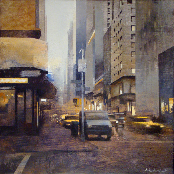
"even prettier once it got dark" (2012) Oil on Canvas, 180 x 240 cm (5.9 x 7.9 ft)

"Even prettier once it got dark" detail

"Ellipsis" (2012) Oil & Acrylic on Canvas, 180 x 240 cm (5.9 x 7.9 ft)

"artificial light" (2012) Oil on Canvas, 180 x 240 cm (5.9 x 7.9 ft)

O'Donoghue is an Irish artist currently in Germany whose work is a fascinating exercise in reverse engineering. All painting is about seeing, but what happens when seeing is filtered through  pixels and compression formats, erasing details that we barely notice are gone? His work looks in at the missing detail and reinvents it in an extraordinary series of process paintings. You need to do 2 things real quick (if you haven't already): 1. Go back up to look carefully at the detail image of "Even prettier once it got dark" and see where it fits in to the whole of the original. 2. Note the size of these paintings! The paintings are composed of discreet pieces, like pixels, but each pixel is treated like it's own abstract image with the loving attentions of brush and color. We have seen things along these lines before of course. Pixelated images composed of hundreds of other images became almost a cliche in the previous decade, and Chuck Close has been working with similar ideas for much longer. But O'Donoghue brings a unique approach. Tremendous attention and subtlety is brought to bear on the discrete pieces so that they can no longer be seen as mere pixels. He introduces invented and beautiful detail where it was lost. At the same time the overall image is disintegrating, losing it's cohesion as if through signal noise or the slow processing of a moving image. His choices of recent subject matter (culled from the infinite gathering space of the internet) seem to parody this structural contrast. Amusement parks, casinos and the mass experience in general reflect both the rich intensity of human experience and the disintegration of the self into a sometimes meaningless kaleidescope of external stimuli. This work is, in short, a powerful visual commentary on the rewiring of our connections to reality.

Trying to share them like this, as small digital reproductions, is almost a bad joke. I myself have never seen the originals but I can extrapolate in my mind what is going on here and imagine the effect, if imperfectly. I'm hoping you can too. And maybe one of us will get a chance to see the real thing someday.

You can see more work and many more detail images as well on his website: www.endaodonoghue.com
His work is currently on display through the 18th of January in his hometown of Limerick, Ireland at gallery.limerick.ie

And sorry for the delay. I'll have more work up next week.