When I started trying to promote my own artwork online I kept coming across other people's art that amazed or compelled me in one way or another. This blog has been a way for me to practice thinking and writing about art, as well as learning more about my peers and all the incredible art that is being made out there.

Search for an Artist on this blog (or cut and paste from the list at the bottom of this page)

Showing posts with label Illustration. Show all posts

Wednesday, February 12, 2014

Eric Joyner

"Lunch Break"

"Catfish"

"All Wrapped Up Again"

"Home Away From Home"

"Jungle Trek"
It's odd. This morning I suddenly had a craving for a donut. I don't eat donuts all that often often. But I like them. Only I'm at work and there's no place nearby to get one. So instead, I thought it was high time to revisit the work of Eric Joyner. He has turned donuts and toy robots into his personal iconography. Armed with a real talent for traditional realism, an exuberant sense of humor and a wry taste for nostalgia he has created what can modestly be described as a unique body of work. I can imagine someone saying that this isn't really serious art. To which the only reply could possibly be, hooray! Serious art can be great, don't get me wrong. But sometimes it's all just so... well, serious. It can give you a headache after a while. The perfect remedy for that sort of thing might be right here. Of course you can't fill up on donuts all the time, but every now and then they're just the thing.
His website is very complete and includes full galleries for every year going back to 2000. So go, and enjoy: ericjoyner.com

Tuesday, September 24, 2013

Jun Kumaori


I don't know the titles, the sizes or the media for these images but what I do know is that they demonstrate a surprising and rich combination of animé style illustration and fine art craftsmanship. The two combine to create oddly touching portraits of adolescence infused with fantasy and nostalgia that somehow manages to be neither cloying nor cliché. The artist who, according to Zach Tutor at the Supersonic Electronic art blog, is only 25 is certainly someone to keep an eye on.
You can see much more at the artist's website: kumaori.info

Thursday, August 1, 2013

Nick Sheehy aka Showchicken

"The Sitting"

"The Woodcutter"

"The Damage"

"Masque of the Red Death"

cover art for the first issue of Tiny Pencil magazine

I posted Nick Sheehy's work almost two years ago (Sept. 2011) and he's been busy since then. While I enjoy pretty much everything he does just recently this series featuring a peculiar double skull character has resulted in some of my favorite pieces to date. Nick is an Australian born artist who studied sculpture in Tasmania, only to drop out of art altogether for a spell. Now living in southeast England his artistic interests were reignited by the low-brow and graffiti art movements. I rather like what I wrote last time so for once I'm going to simply paraphrase what I said before:

His unique surrealist narrative vision begs the viewer's mind for a rich tapestry of story and myth. It's as if the mythology, the gods, heroes and queer characters that inhabit his work always existed but we forgot about them. That is until Mr. Sheehy's came along with these illustrations to remind us of this elaborate and haunting heritage.

His work has a mythic dimension and an almost epic scope, even while the individual pieces themselves are small and delicately drawn. It's well worthwhile to take some time and look back through the evolution of his imagery. You'll see familiar motifs and characters recur not because he's stuck on old ideas but because that's how stories work. Each time something recurs it's as if a familiar thread is being brought back into an ever growing and elaborate tapestry of myth making.

Check it out on his Flickr page or on his website: www.showchicken.com


Monday, March 4, 2013

Hsiao-Ron Cheng

"Weeping" digital painting 2012

"February Afternoon" digital painting 2012

"The Child and the Fox"  digital painting 2013

"November"

"Stuck" drawing

Hsiao-Ron Cheng is a Taiwanese artist exploring the world of pop-surrealism. She works primarily digitally, so for once I don't have to fret too much about not being able to see the work in person. This is it, if not at the highest resolution possible. Her themes are focused squarely on childhood and nature, how the two naturally intersect and how they are all too often separated. I think there is longing in all children for a deep connection to the natural world. For those that grow up in dense urban environments, that longing can turn into a bittersweet heartbreak of fantasy and despair. The lost presence of nature "out there" is internalized and comes to represent the sense of isolation and and separateness that most children experience as they near maturity. It is a poignant emotion both universal and intensely personal. Each experience of this sort is likely to make a person ask, "Am I the only one?" The answer of course is no, but sometimes it is only art that really can communicate this truth with any meaning to those who feel on the verge of despair. I suspect that her art has touched more than a few young people out there.
You can see more at her website: hsiaoroncheng.com or on her Flickr page.
thanks to booooooom.com for posting her work before me.

Thursday, January 31, 2013

Lindsey Carr


Platonic Solids I


"Garden"
The Flower House

"La Bizarre Singerie"


from the artist's website: Singerie is a French word meaning 'Monkey Trick' and refers to a genre depicting monkeys mimicking human behavior - it reached its stylistic epitome during the 18thC in the decorative motifs of the Chinoiserie Rococo period.
The scenes commonly involved monkeys dressed as Mandarins balancing on high wires, serving tea, fishing, playing. It gave such a saccharine and genteel view of human activities for what was to become a bloody century in European history.


Simius Religiosus

There are a few other artist out there who riff on the lush work of John James Audubon and other scientific illustrators of the 18th & 19th century. Justin Gibbens springs to mind. For originality and wit Lindsey Carr's work is on the same high level. Audubon famously depicted his birds in appropriate botanical settings. Lindsey Carr's work has animals, plants, insects and others sharing her pictorial space in completely unpredictable, sometimes downright surreal ways. Her work seems to comment on the interplay of species, sometimes meditating on the extraordinary synthesis of life and the wondrous balances of co-evolutionary processes, and then at other times fixating on the grim and brutal struggles between species that constitutes natural selection. Which is fitting. Because neither picture accurately captures the grand scope of nature, nor our fascination with it. But her primary interest may not be the natural world at all. Referencing all manner of cultural and historical practices she holds up the examination of nature as a mirror in which to examine our very strange and mysterious selves. Beyond that the work is quite simply exquisitely conceived and executed. I only wish there was a little more information about some of the pieces sizes and media. The first image here "Platonic Solid I" was posted recently on her blog with the comment that it reflects "A tiny shift in focus". I'm looking forward to seeing more of that shift! Go check out her website and look at loads more: pickle-town.typepad.com

thanks to the folks at artistaday.com for posting her work.

Thursday, September 13, 2012

Robert Sato - new show

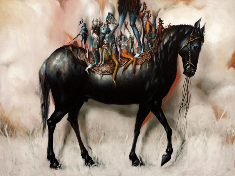
"Siege" from the new show "Haunts"

untitled from the new show "Haunts"

"Island"  watercolor on arches paper  16" x 17"  2011

"Asleep at the Wheel"  watercolor on molachi paper  9" x 9"  2011

"Ghost Ride"  watercolor on molachi paper  35" x 84"  2011

I posted some of Robert Sato's watercolors just one year ago (Sept. 1, 2011), and had almost nothing intelligent to say about the work except that I liked it. Well, I still do. And if I happened to be in L.A., which I'm largely grateful not to be, but if I was, I would most definitely go see his new show "Haunts" (along with artist John Pham) which is currently up at Giant Robot through Sept 26). Robert's work often depicts conglomerations of objects, flying apart or coming together to form new objects. Individual items are often morphing into other things or are in fact two things at once, or perhaps unrecognizable pieces of a something else altogether. There is no doubt that surrealism is the most useful label here, but there is sometimes a more conscious meaning. The chaos that seems ever present here reflects the chaos of our post-industrial world which has turned out to be just the opposite of industrial age dreams. Hopes for technological solutions to all the world's woes and an orderly arrangement by human reason have given rise instead to confusion, unpredictability and possibly, in the end, collapse and disintegration. Robert Sato's vision is not a grim commentary on all this, but rather one of a lively participation in the ensuing anarchy.
Please check out his website: www.robsato.com

Thursday, July 19, 2012

Santiago Caruso

"Cabinet of Wonders"

from "The Bloody Countess"

"Portrait of Crime"

"You Look Like Rain"


Santiago Caruso is an Argentine illustrator and artist with an intensely dark surrealist vision. It came as no surprise to me to find that he has done a great deal of illustration work for the writings of H. P. Lovecraft. There is an undeniable atmosphere that both share, not merely dark, but hyper-sensitive, paranoid, on the threshold of madness. The themes are myth, mortality, temptation and the supernatural. It's a rich vein of material that is more generally mined by lesser talents. Clichés are usually the norm in the genre of horror, so for anyone who enjoys that sort of thing, it is a rare treat to find material that treats it with both seriousness and originality. If you count yourself among those, then you really need to spend some time browsing his website. He has a lot of material to look through, and for many of the images he provides extraordinary detail images and process shots capturing his painstaking and exquisite technique.
www.santiagocaruso.com.ar

Thursday, July 5, 2012

Marco Wagner


Like the artist in my previous post (Esao Andrews) and many others, Marco Wagner is another artist/illustrator blurring the lines between the two endeavors.The term pop-surrealist is sometimes used to describe the genre, although the more familiar I become with it the less suitable the name seems. But that's the nature of labels. Marco Wagner's work reflects the nuanced differences between artists of this sort in Europe and those in the U.S.. Much of the work in the U.S. leans towards the cartoonish, fantasy, or kitsch, often but not always with a healthy dollop of sarcasm. Marco Wagner's work on the other hand leans toward a generally more serious tone with a greater emphasis on design and technique. These are often dark images and somber themes tempered slightly by a lightness of approach.
There's plenty of both his personal work and his illustration on view at his website: www.marcowagner.net

Monday, July 2, 2012

Esao Andrews

"The Stray" 24"x 24" oil on wood. 2011

"Polished & Powdered" 24"x 36" oil on wood. 2011

"Drifters" 36"x 48" oil on wood. 2010

"Meigh" 20"x 24" oil on wood. 2010

"The Haircut" 8"x 11" oil on wood. 2011
Esao andrews is among an enormous group of contemporary artists who intentionally blur the line between fine art and illustration. What I find refreshing about a lot of them, and Esao Andrews is no exception, is that they combine a real dedication to craftsmanship and skill with unfettered imagination and a whimsical visual inventiveness. His work is wide ranging and it would be difficult to pin down specific themes, but in general I see elements of childlike innocence and fantasy combining with a darker vein of psychedelia. Not every piece works, but why should it? That's what invention is all about. Trying new things. Looking through his portfolio, and that of others like him, you're reminded over and over again that the potential for representational image making is truly unlimited. We should all be glad that pioneers in the 20th century opened up the possibilities of abstraction, but declarations of the death of representation were not just premature, they were absurd. And representational artists like Esao Andrews use elements of abstraction to enhance the inventiveness of their own work.
You can see much much more on his website: esao.net

Tuesday, November 22, 2011

Lekan Jeyifous

"Urban Growth Strategy 1"
"Central City Settlement"

"Craters"

"Hydro City Settlement"

"Outer City Settlement"

Lekan Jeyifous is a Nigerian born and Brooklyn based... um... architect? yes. Designer? sure. Artist. certainly. His work is much more far-ranging than what I've posted here. This is just the stuff that first appealed to me; work that integrates graphic novel/sci-fi aesthetics with the fascination of detailed charts, maps, blueprints and other technical visuals. In everything he does the presence of New York City, and Brooklyn especially, looms large. This is urban art with an urban message to an urban audience. The message? Well, maybe it goes something like this. "This place is seriously messed up. I wouldn't live anywhere else." He captures something of why the occupants of big cities feel this way: All the crowding and chaos, the slow decay at the margins and the dilapidated facades of industrial ruin somehow manage to co-exist alongside a thriving population ever ready to reinvent itself and its environment. There is an odd phenomenon that exists in the minds of city dwellers where even a dark dystopian vision of the future seems in some ways kind of exciting. In keeping with this sort of futurist mentality he keeps his media process mixed giving it a look both modern and aged. "The drawings presented here started out as digital images that were outputted, sketched and drawn over, and scanned back into the computer in order to be retraced, textured, and layered." All of which makes the images seem as if they were historical documents from some distant future relating to one less distant. You can see more work like this and plenty of other stuff on his website www.vigilism.com
I came across his work initially on the art networking site: bluecanvas.com