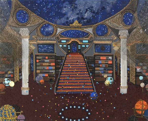
When I started trying to promote my own artwork online I kept coming across other people's art that amazed or compelled me in one way or another. This blog has been a way for me to practice thinking and writing about art, as well as learning more about my peers and all the incredible art that is being made out there.

Search for an Artist on this blog (or cut and paste from the list at the bottom of this page)

Showing posts with label Interiors. Show all posts

Wednesday, September 4, 2013

Michiko Itatani

"Cosmic Wanderlust" painting from CTRL-Home/Echo CRH-11 2012 78" x 96" oil on canvas

"Cosmic Wanderlust" painting from Cosmic Theater CWC-9 2011 78" x 96" oil on canvas

"Cosmic Wanderlust" painting from HyperBaroque CWH-1, 2012 60"x72" oil on canvas

"Cosmic Wanderlust" painting from Cosmic Theater CWC-178" x 96", 2010, oil on canvas

"Cosmic Wanderlust" painting from Cosmic Theater CWC-52010, 96"x78", oil on canvas

Trying to review these paintings by looking at tiny online images (most of these originals are eight feet wide by six and a half feet tall!) is probably a bit like trying to describe the night sky having only ever seen a photo of it. Of course it's entirely possible that seeing the actual work would be a letdown. Possible, but given the general quality of art shown at Linda Warren Projects in Chicago, where Michiko Itatani's most recent work is now on display, that seems highly unlikely. While her subject matter and imagery varies, there is something especially appealing to me in these grand imagined interiors, "cosmic theaters" indeed. They're like a cross between the ancient library of Alexandrai, the wonders of Byzantium and something out of Star Trek, all suffused with an ethereal unreality that borders on the religious. But if religion is implied it is a secular one, a religion of knowledge and art. These spaces seem like high vast churches dedicated to narrative, knowledge and dreams. There is no god in them other than the artist herself, for these scintillating images exist as a kind of subcreation (a term coined by JRR Tolkien) in which the artist does not ask us to suspend out disbelief, but instead, through detail and consistent vision, compels our acceptance of her reality for the duration of our interaction with it. But really, I'm just guessing. I need to see these for myself. If only I could. If you happen to be in Chicago this September please go check them out at Linda Warren Projects
You can see much more of her work online at her website: www.michikoitatani.com

Thursday, August 15, 2013

Dina Brodsky

"Vacant"  oil on mylar on plexiglass  8x8 inches

"Living Room"  oil on mylar  6x11 inches
"Off Northern Boulevard"  oil on mylar  8x8 inches

"Golden" oil on mylar on plexiglass  8x8 inches

"Trading Post"  oil on mylar  8x8 inches
Dina Brodsky works small. I could easily imagine these paintings large, overwhelming the viewer with their brooding atmosphere of abandonment and decay. But no. They're small. Very small. Sometimes small works get short shrift in the gallery scene. Large crowds cannot gather before a tiny painting and collectively murmur their emotional responses. No. Each individual must wait his or her turn to approach the piece and experience it alone, often leaning forward slightly, perhaps squinting, as if peering into a tiny window on another world that, for a moment anyway, only they can see. How does this effect the kind of vision that Dina Brodsky presents? I can only guess having never seen the work in person. But I like small works. I like that intimacy, the personal connection small finely crafted work demands. These are worlds I want to peer into. They echo those intimate lonely parts within my own heart. Doesn't everyone have a bit of that inside them? That's what these paintings are for. To recognize that part within you that is not only lonely, but defiantly so; that part within us all that no one else can ever quite reach but helps define who we are. I look at these paintings and I can hear the crows cawing and feel the November chill. And to me they seem inviting.

Her website is alas no more. Her galleries have only older or very limited work to view:
Artana Gallery and  Mark Miller Gallery
The best way to see more right now appears to be on her Facebook page or you can see all her work from this year on a temporary(?) wordpress page dinabrodsky.wordpress.com

Thursday, March 7, 2013

Lyla Duey

Bathroom (2011) oil on wood 6" x 8"

Doubleroom (2011) oil on wood 9" x 12"

Kitchen (2011) oil on wood 11" x 14"

A Nice Wall Piece (2012) oil on wood 11" x 14"
Broken Chair (2012) oil on wood 14" x 18"

Lyla Duey's recent work has a tremendously enjoyable premise. She makes simple line drawings of various places and objects in her home. Then she cuts out the objects in the drawings and reconstructs the scene in three dimensional models. The paper models reflect the distortions of perspective in her original drawings. Then she makes a painting of the model. So she starts by looking at three dimensions, re-interprets it in two, then re-interprets that back into three, and finally re-interprets that into two dimensions once more. It is a fairly unique exploration of what the illusion of depth in two dimensional art means, how it communicates to us both accurately and inaccurately about the real world in which we live. But it is an exploration of such ideas without pretension or self-importance, a relieving balm amid innumerable artists trying to make profundities out of inanities. Here we are simply witnessing an enthusiastic meditation on and fascination with the act of observation. She has other work as well which she tackles with the same careful attention to detail and amusing wit. You can look through it all on her website: www.lyladuey.com
Thank you Lyla! And congratulations on being included in 104th issue of New American Paintings.

(just a warning though; her images are hi-resolution files so if you have a slow connection they may take a little time to load).

Monday, September 17, 2012

Carolyn Swisczc

"Food Court, Santa Fe NM"  acrylic, relief ink and rubber stamp on canvas  48" x 73"  2011

"Whitney Lobby #1"   acrylic and relief ink on canvas  36" x 48"  2011

"Lyndon B. Johnson Presidential Library and Museum, Austin TX"  acrylic and rubber stamp on canvas  48" x 73"  2011

"Karate Extreme"  acrylic, ink, relief ink and rubber stamp  18" x 22"  2005

"Showcase Cinemas, Revere MA"  acrylic, relief ink and rubber stamp on canvas  48" x 72"

Carolyn Swiszcz (pronounced Swiz for those like me who have to be hear every word or name in their heads) is an artist currently in St. Paul Minnesota, whose work is like a series of encounters with modern American architecture, both ordinary and extraordinary, banal and peculiar, and often all of these at once. She has a vivid graphic style using acrylic paints, printmaking techniques and even rubber stamps, that somehow captures a surreal atmosphere to scenes we might otherwise pay little or no attention to; a strip mall, a lobby, an old motel, the marquis for a suburban cinema. Through composition and careful attention to patterns and shapes, she draws out details of the innocuous and makes them interesting with the simple trick of forcing us to look at them. She seems to see through the ordinary and find within it, not banality, but a delicate mood of acute nostalgia and haunting melancholy. The addition of figures in some of her more recent work, often an adult with a child, brings a degree of warmth to the images, but suggests to me that the haunting quality is in part the haunting of our own childhood, that often too dimly remembered time when nothing was ordinary, simply because everything was new. Recapturing that perception and communicating it with an adult's knowledge and skill, is essentially the very heart of the artistic endeavor.
You can see more at her website: www.carolynswiszcz.com
There are a lot of images available and slightly larger at here gallery's site: stevenzevitasgallery.com

thanks to the folks at http://www.booooooom.com for posting her work.

Thursday, June 30, 2011

Maggie Evans

Forgotten Conversations, 35” x 60”, charcoal on paper, 2009
Difficult Decision, 25” x 36”, pastel on paper, 2009

Hesitation, 18” x 13”, pastel on paper, 2010

Vulnerable Position, 18” x 34”, pastel on paper, 2010

Anticipation, 30” x 36”, pastel on paper, 2010
Maggie Evans creates complex psychological spaces simply by arranging chairs and tables in particularly defined interior spaces. Ok, maybe it's not quite that simple. Much of the psychological evocation comes from the ghostly quality of her technique, using pastels on stretched paper. Nonetheless, there is something remarkable about her ability to use the same very basic elements over and over, and create such a variety of subtly nuanced social scenarios. All without figures or faces. Some of her earlier work depicting bar scenes did include figures. But it seems that the figures faded over time until they eventually vanished altogether. Against expectation this allowed for a richer psychological atmosphere to occupy the images. Instead of specific individuals experiencing a specific situations she used the remaining furniture as symbolic stand-ins for any manner of individuals, allowing the mere position and proximity of them to indicate the potential for tension. The work is about this psycho-social potential instead of mere portrayal and interpretation. You can see more of her work including those bar scenes on her website: www.maggieevansart.com


I saw her work in the latest issue of New american Paintings (issue 94 - southern region). Congratulations Maggie.

Thursday, June 2, 2011

Susan Bennerstrom

"Gage"  32" x 48"  2009

"Spiral no. 1"  32" x 48"  2008


"Hotel Boss"  47" x 53"  2010
"Ebey"  18" x 26.75"  2010

"Rise"  40" x 48"  2010

 Susan Bennerstrom's art employs realism but ultimately has another objective. The artist works from photos but the photos are merely a starting place for spatial abstraction. She simplifies the forms, removes extraneous detail and carefully models the lighting to create the illusion of complex geometric spaces. There's plenty of references left to identify the location. It's a fine tuned reminder that abstraction and representation are more closely related than most people think. She began her career working exclusively in pastels, both chalk and oil. But in 2008 she switched to oil paints and has worked in this media consistently ever since. The pastels lent her earlier work an atmospheric quality which was appropriate as she concentrated more on light, depicting landscapes as well as buildings and interiors. But her gradual focus on these these interior architectural forms has made the switch an appropriate one. The light in her work is still a prominent feature, but it is subservient to the forms themselves, helping to carve them out with sculptural precision. The brushwork lends the whole a tremendous sense of solidity.

Though the essence of these paintings is one of stillness, the dynamic of narrative is nonetheless powerfully present. For narrative is such a deeply human instinct that the lit stage, even without the actors can be as compelling as any play. and the promise of a story as powerful as story itself. Her quiet sets seem saturated with possibilities and perhaps, even a little mystery.

You can see much more of her work on her website: www.susanbennerstrom.com

Tuesday, May 31, 2011

Kirsten Everberg

"Cinema, (LA Theater)", 2010, Oil and enamel on panel, 72 x 96 in.

"Cinema, Balcony (LA Theater)", 2010, Oil and enamel on canvas over panel, 72 x 60 in.

"Bar", 2003, Oil and enamel on canvas over panel

"Church, Haut du Lievre, Nancy, 2005, Oil and enamel on canvas over panel, 72 x 108 in.  

"The Armory, NY (Field and Staff Room)", 2010, Aquatint, etching on Somerset paper 300gr, 17.9 x 20.8 in.

I was recently nosing around some LA area gallery websites and stumbled across these images which immediately grabbed my attention. Probably because I recently did some theater pieces myself and have been thinking along the lines of ornate interiors. Most of her recent work has been in the form of black and white aquatint etchings, an under-represented media in contemporary art if ever there was one. But for me it's the paintings that best convey the loose energy of her work. Viewing art on the internet is not a very fair process and one has to extrapolate a lot based on the experience of viewing art in real life. Printmaking is especially hard to appreciate via electronic media. But whether it's etching or painting she manages to convey a sense of the fussy detail, the cluttered energy and baroque furnishings of a bygone area with a very modern gestural simplicity. She uses the same approach to depict more contemporary spaces as well, allowing rough imperfect lines and hastily blocked in forms of color to give the cleaner lines a rough vitality. Either way I find her work mesmerizing and inspiring. Maybe I'll even get a chance to see it in person when I go down that way this July.
You can view more at her gallery's website: www.1301pe.com
There's a few images available on artnet.com

Friday, April 29, 2011

Michelle Muldrow

"Delirium"  20" x 10"  casein on clay panel

"Reconfiguration"  20" x 10"  casein on clay panel
"Altar in Orange"  acrylic on canvas
"Searching Light"  12" x 12"  casein on clay panel
"Blight and Consumption; Bedford Heights, OH"  34" x 22"  gouache on paper
Michelle Muldrow has been exploring the potentials still lurking within the landscape genre and what it means to be picturesque. She has contrasted the notion of the picturesque by incorporating it into her depictions of urban and suburban decay. More recently she has been exploring the idea of the sublime as it might be conveyed by cathedral architecture, by the light and airy spaces lit by stained glass windows. Only here she turns the idea of the sublime on it's consumerist head by using as her subject the chaos and clutter of a big block store. Beyond the philosophical intentions of her work, there is no denying that she has a fluent if not instinctive understanding of color and design. She employs her marked craftsmanship to tremendous effect conjuring the vagaries and contradictions inherent in our perceptions of the american landscape. You can see more on her website: mmuldrow.com

and thanks again to the folks at www.artistaday.com for bringing her work to my attention

Tuesday, March 1, 2011

Cindy Tower

"Passage", 2010  72 x 68 inches, oil on canvas

"Maintenance Walk", 60 x 60 inches, 2010 oil on canvas

"Seam", 2009  84 x 71 inches, oil on canvas

Tommy Knocker  2007   Oil on silk  68 x 43 inches
Painted in Federal Mill #3, Leadington, MO

Site Painting Photo by Malcolm Gay
Tower painting "Big Wheel" (above) inside a "borrowed" studio- (trespassing) in East Saint Louis
 Cindy Tower's large scale paintings of abandoned factories and similar sites, capture the romance of decay. Post-industrial America (and Europe, and Russia) has become a kind of 'pilgrimagic' destination for recorders of a lost civilization; like those 18th century artists painting the great monuments of antiquity rising from bases of rubble and dripping with vines. Only here the lost age is a much more recent past. And it's not as though the technology has vanished. Much of it has merely moved to developing countries where all the same stuff is still shiny and new. The scale and scope of the abandonment has captured the imagination of quite a few artists, especially photographers who share their documents on group sites like Flickr and LiveJournal. While photographers have the advantage of being able to get in and out of these sites relatively quickly (almost without exception such sites are legally off limits), Ms. Tower's work, done on location, intensifies the experience in a way that a photograph cannot. Her painting is a kind of post industrial impressionism. The chaos and the detritus are enhanced in loving layers of marks and colors allowing the more legally minded viewer to get a real visceral sense of what these locations are like, and more importantly, what they mean.

She does much more work than what I've shown here, including installations and landscape paintings, but her almost fussy brushwork lends itself exquisitely to this particular subject matter.
There is so much to look at on her website ( www.cindytower.com ) that you may want to bookmark it for a bit and go back several times to see it all.

I'd like to thank River Styx magazine for putting her work on the cover so I could find out about it.

Thursday, February 24, 2011

Tonia Ackermann

"atelierszene", Painting, acrylic on canvas, 2009, 135 x 75 x 4 cm

"bartelsstraße", Painting, acrylic on canvas, 2008, 150 x 100 cm

"hinterhof", Painting, acrylic on canvas, 2005, 75 x 75 cm

"unterm dach", Painting, acrylic on canvas, 2005, 125 x 150 cm

"hausflur", Painting, acrylic on canvas, 2005, 150 x 175 cm
Tonia Ackermann takes a scene and fractures it into separate panels, each individually rendered. The pieces vary to greater or lesser degrees of color, perspective and even time, creating fascinating studies of the nature of observation. I think we've all seen something similar done with photography, most famously (though certainly not originally) by David Hockney. But approaching this in paint adds an element of depth, of heightened randomness. Like the abstract colored squares in Chuck Close's monumental portraits, one has the sense that each is created in reference to the whole but without reference to its neighbors, suggestive of the appearance of order from random processes. Breaking up the scene into smaller parts also naturally lends itself to a kind of fish eye perspective and some of the work, especially the 2009 piece "atelierszene", at the top, reminds me a bit of Gideon Bok's interiors. It's engaging work and the potential for further exploration is almost infinite. You can see more examples of her work here: http://www.artdoxa.com/Tonia. (She does not appear to have any other website and you must join this site if you want to contact the artist).