When I started trying to promote my own artwork online I kept coming across other people's art that amazed or compelled me in one way or another. This blog has been a way for me to practice thinking and writing about art, as well as learning more about my peers and all the incredible art that is being made out there.

Search for an Artist on this blog (or cut and paste from the list at the bottom of this page)

Thursday, May 27, 2010

Erick Swenson

Erick Swenson uses polyurethane resin, polystyrene, MDF (medium density fiberboard), and acrylics to create hyper-realistic sculptures of strangely fantastical creatures. In the two cases below the creatures are dead. The first piece here is particularly fascinating in how the realism serves the fantasy. The deer is clearly decaying, revealing different layers of anatomy. At the core of course is the skeleton, but the skeleton is covered in a scrimshaw of ancient mariner charts. A map. But a map to what? There is no way of knowing of course. Most of it remains hidden in what was once the armature of a supposedly living creature. There is the suggestion that within all life is there is a secret of meaning and direction, but the revelation of that purpose lies in the slow process of death, decay and transformation. Wonderful and mythical stuff.
See more at his gallery's website: www.jamescohan.com


"Ne Plus Ultra" 2010 17" X 72" X 54"


"Ne Plus Ultra" detail


"Ne Plus Ultra" detail


Untitled, 2007 Polyurethane resin, acrylic paint, MDF, polystyrene 30" X 181" X 280"


untitled, detail


untitled, detail

Thanks to the artist Michael McDevitt for bringing this artist to my attention.

Tuesday, May 25, 2010

Selena Maestrini

Recently I came across the work of Selena Maestrini on Flickr (thanks to a posting there by artist Tim Lowly). These are small pieces that might go almost unnoticed on a gallery wall except for those with the patience and interest to get up close and scrutinize. But the web makes this distinction unimportant, and the more I looked the more I found to like. Her work relies on a variety of mark making and incredibly rich textures to fill out sparse compositions and simple drawing. The combination in her capable hands is highly effective, especially in her portrayals of utilitarian spaces. She looks carefully at forgotten corners, bits of shelving and table surfaces, expanses of floor, and finds evocative patterns and shapes. And there's light. It's often subtle but it's always there and handled with the same deceptive simplicity as everything else. There's a tremendous amount of work to look through so get started.


l'unico colore 18x14
cm


guarnizioni


portagioie


laura 16,2x12,5
cm


contenitori 12,2x16,5cm


Elisa 14x13cm

Monday, May 24, 2010

The Broad Street Studio

For something slightly different I'm featuring three artists here. They present themselves as a united front of realist painters interested not so much in realism for it's own sake, but as a way of describing the often offbeat perceptions of each artist.

Joshua Suda plays with portraits and especially eyes peering through the surfaces of torn paper and matte frames and even other portraits addressing realism quite directly as an illusory tool of the artist.

Brian Martin explores evening and night scenes sometimes to directly convey the dramatic and unusual lighting such times display and sometimes to convey the inherent sense mystery that imbues all of our interactions with the dark.

Jason John is interested in psychological portraiture, adding props and peculiar settings to convey something about the people he is painting or maybe something about the artists himself. All art, they say, is about the self.

Their website (www.thebroadstreetstudio.com) also features some great interviews with other artists and art porfessionals, two of whom (Alex Kanevsky and Lori Field) have featured on this blog.
Also check out their facebook page.


Joshua Suda


Brian Martin


Jason John


Friday, May 21, 2010

Anna Conway

By all accounts there is an element to these paintings that simply cannot be conveyed through the internet; namely, her method. I could wish for some detail shots to give us at least some idea of what is reported to be an astonishing degree of meticulous rendering. However even without the impact of that to affect us these are still compelling images of cryptic narrative realism. Those of you who actually read this blog (anyone? anyone?) might realize at this point that "Cryptic Narrative Realism" is not a bad moniker for a huge chunk of the work represented here.

I found out the following tidbits by reading some of her press. I read the press because the images intrigued me. I repeat these tidbits here not because they provide any insight into the work but because I think they make them even more intriguing.
1. In "A Pound of Cure" those are 4 tiny figures lying on their stomachs around the pool with their arms extended into the water.
2. In "Alejandro" that huge object is some kind of giant balloon or float like thing that has gone amok.
3. The title "Twenty Fourth Sunday in Ordinary Time" refers to a day outside the Catholic holy seasons.
There's more, but alas not that much more, at: www.guildgreyshkul.com
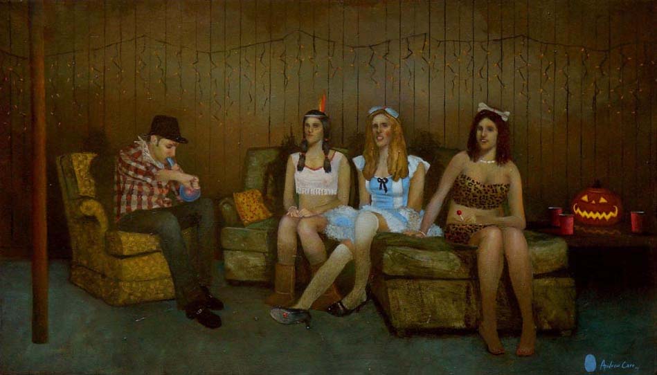


"Enfield, MA" 2006 Oil on panel 46" x 68"


"A Pound of Cure" 2005 Oil on panel 36" x 60"


"Alejandro" 2005 Oil on panel 40" x 65"


"Twenty fourth Sunday in Ordinary Time" 2007 Oil on panel 46" x 68"

Wednesday, May 19, 2010

Samuli Heimonen

Samuli Heimonen is a Finnish artist whose work centers around bold simple visual concepts, not unlike certain illustrators. Brad Holland comes to mind. Mr. Heimonen's more recent work seems to focus around images of certain animals, although it is clear that he is less interested in the natural forms themselves than what they convey to us as human beings. The paintings are more surreal than symbolic in that there is no concrete key to their meaning, and so they work as dreamlike images. They may represent the artist's attempt to approach some kind of personal understanding of the animal within us and what that says about our relationship to the natural world. In that light the work should be seen as an ongoing process, rather than individual completed paintings, although many work quite well in that sense as well. He has uploaded a great quantity of images compiled chronologically which further suggests to me a focus on the gradual development of his visual thinking. I could wish that the images were somewhat larger or that details were provided. Oh well. There's much to enjoy on his website www.samuliheimonen.com


"With my own eyes" 145 x 175cm Acrylic and oil on canvas 2009


"Flower" 195 x 195cm Acrylic and oil on canvas 2009


"Gratitude flies away" 145 x 175cm Acrylic and oil on canvas 2009


"Army of One" 140cm x 160cm Acrylic and oil on canvas 2007

I believe I first came across one his images at saintstigersloversart.tumblr.com although it appears to have since been removed.

Monday, May 17, 2010

Justin Mortimer

Justin Mortimer's paintings are predominantly about death, violence and humanity's appalling capacity for self destruction. So... happy Monday, right? But don't skip over these too quickly just because your stomach is till unsettled by that bad coffee you just drank. While this type of imagery is usually associated with news stories coming out of war torn developing countries these paintings suggest that such horrific events may be much closer to home than we realize. And technically the work is pretty amazing. His dynamic use of architectural forms with the figures creates some powerful compositions, which serves to make the overall impact of his dark vision all the more effective.
You can go to his website justinmortimer.co.uk but it will just redirect you to these two galleries where you can see more work:
nicodimgallery.com
www.masterpiper.com


"Colony", 2010, oil on panel, 70 x 100 cm


"Theme Park", 2009, oil on panel, 60 x 80 cm


"Depot", 2009, oil on panel, 60 x 80 cm


"Community Project", 2009, oil on panel, 80 x 60 cm

Thanks to visualinventory.blogspot.com

Friday, May 14, 2010

Andrew Carr

Andrew Carr is still pretty young, having earned his BFA in '06. His website is an eclectic gathering of works by an artist who is still trying to figure out what he wants to say. But it's clearly there. Somewhere between his darkly humorous portrayals of youthful indiscretion and his poignant meditations on loneliness there is a voice as clear and candid as Holden Caufield's. His website (www.andrewcarr.net) also features what may be the best artist bio I've ever seen.


"Round 'em up Cowboy" oil 21" x 36"


"Thin Envelope" oil 24" x 20"


"School Bus" oil 22" x 40"


"The Laundromat" oil 30" x 40"


"Bonfire Jump" etching 9" x 12"
(from a series of etchings depicting the college party scene)

Wednesday, May 12, 2010

Simon McWilliams

Simon McWilliams paints the bones of things like they were flowers. Sometimes He paints flowers too. But his favorite subject seems to be iron and steel; scaffolding, girders, the skeletal forms of half finished high rises. Other architectural subjects crop up as well; gates and staircases and greenhouses and chandeliers. His ability to apply brilliant color in an expressive painterly manner to these otherwise austere images can be a fascinating juxtaposition, especially with the buildings, which normally we would perceive as bleak eyesores. Instead there is a kind of fascinating triumphal quality to them. Like Breugel's take on the "Tower of Babel", we know that all this crazy construction might be a bad idea, but damn if it isn't really really cool.

There is quite a lot of work on his website www.simonmcwilliams.com


"Arc II" oil on canvas 29" x 35"


"Red Apartments" oil on canvas


"Traffic Lights II" oil on canvas


"ESB Gas Turbine Power Station" oil on canvas


"Mist in the Palmhouse" oil on canvas

I'd like to acknowledge Skotia Gallery in Santa Fe, NM for introducing me to his work

Monday, May 10, 2010

Ericailcane

The name is signed as one word so I'll go with that and leave the question as to whether it is Erica or Eric undetermined. At any rate the work of the artist extends beyond drawings to include numerous large scale murals, installations and video, but at the heart of it all is the drawing; wonderfully charming, cryptic, sometimes dark, sometimes funny, sometimes poignant, but always alive. I'm really not even sure what else to say about them. They have no individual titles on the website, and frankly do not need them. They have a life of their own which is quite complete without any verbal clues as to their meaning or context. Go to the website www.ericailcane.org and look through them all! When you get to the bottom of the page make sure to click on the word "older" and keep going.


Wednesday, May 5, 2010

Michael Schall

Looking at the gallery website representing Ryan Mrozowski (my previous post) I came across this artist. Michael Schall creates enigmatic narrative scenes of colossal human exuberance. There is an ominous tone to all these visions and while some depict clear warnings or criticisms of our hubris, I also get the distinct impression that he's impressed and awed by, and almost giddy with excitement about, the sheer scale and absurdity of human endeavor. His work is often, though not always, suggestive of some possible future and that future may be both thrilling and terrifying at the same time.
He works in extraordinary detail in graphite, so much of what these pieces must convey in person is lost in an online format. The detail images here are really important. I wish I could include just one that was really close up to see the meticulous individual pencil marks themselves. The black and white format also serves him well as it removes us one step from the almost overwhelming realism and heightens the pure drama of it all.
See more great stuff at www.michaelschall.com
and some more at www.pierogi2000.com


"Remaking the Night Sky" graphite on paper 41.25" x 59.75" 2008


"Remaking the Night Sky" detail


"Mist" 2008 Graphite on Paper 12" x 16"


"Pool of Light" graphite on paper 22" x 30" 2009


"Pool of Light" detail


"Rebuilding the Quarries" graphite on paper 40" x 60" 2008


"Rebuilding the Quarries" detail